3D website examples: ten we built
By Cross Elastic. Published 14 November 2026.
Ten website examples you can open in a browser right now. Five are fully 3D. Five are quieter sites that borrow one idea from 3D. We built all of them ourselves, as concepts, prototypes and sample builds, so each one is labelled with what it is.
Fully 3D websites
After Curfew
Concept · Game
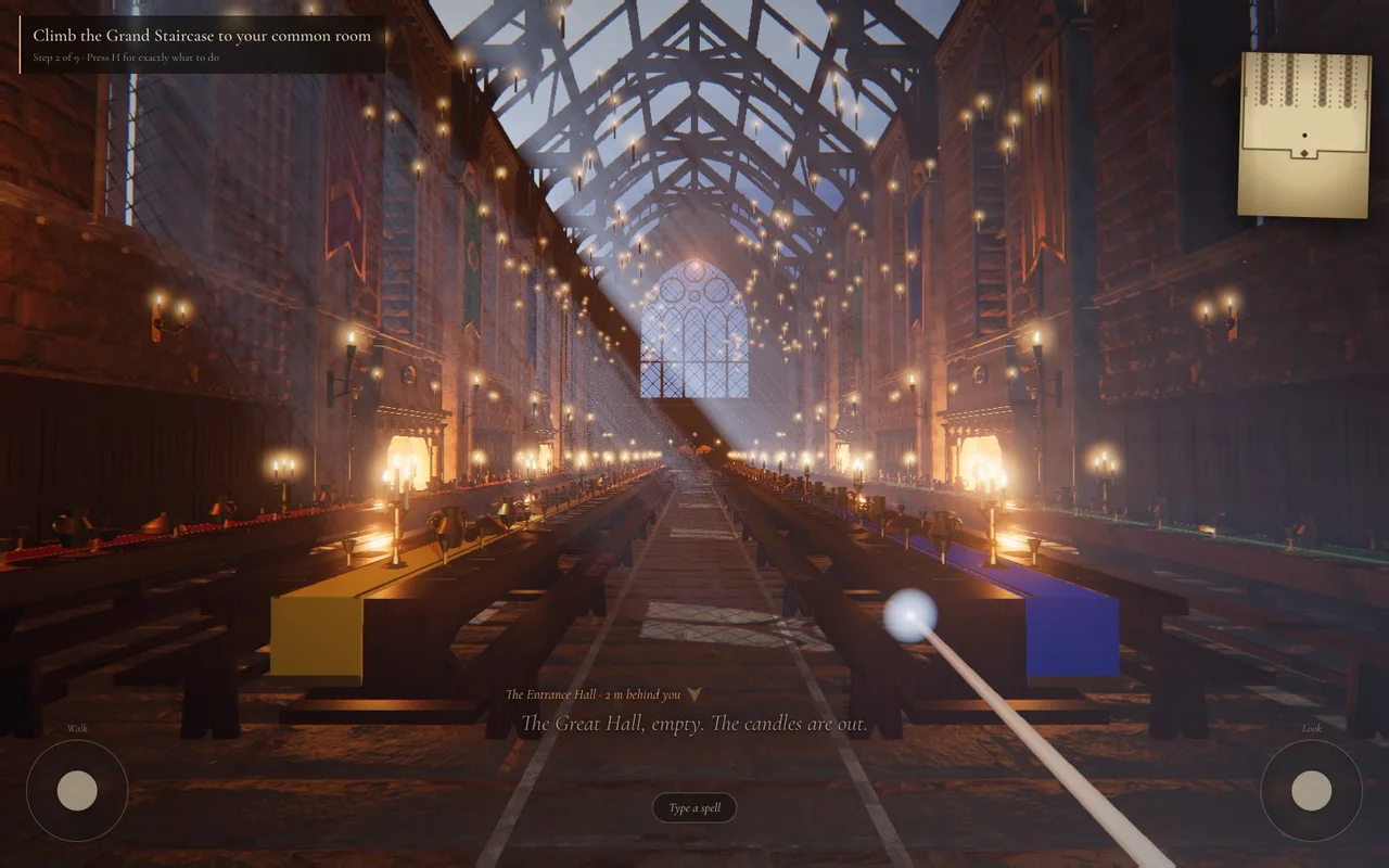
A game that runs in a browser tab. Twelve sets are joined into one castle, so you walk through doors with no loading screens. It shows how far a website can go before it becomes a game.
The Glass Voyage
Concept · Luxury
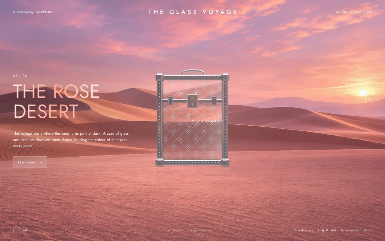
One object stays in the middle while six landscapes change around it. The glass picks up the light of each place. An example of a 3D website for a luxury brand.
Jaywalking
Prototype · 3D commerce
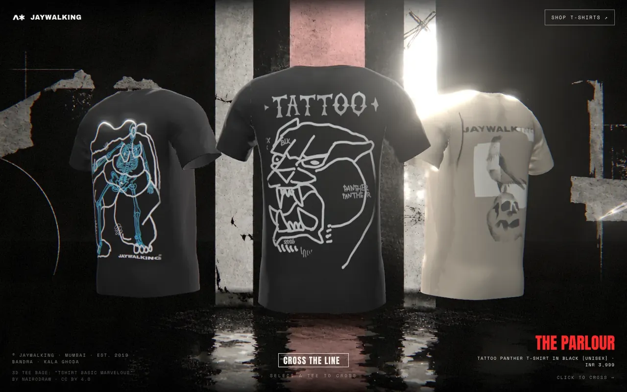
A 3D ecommerce website for a streetwear label. Each T-shirt gets its own room, and the shop button goes straight to checkout.
Nacrelle
Concept brand · Skincare
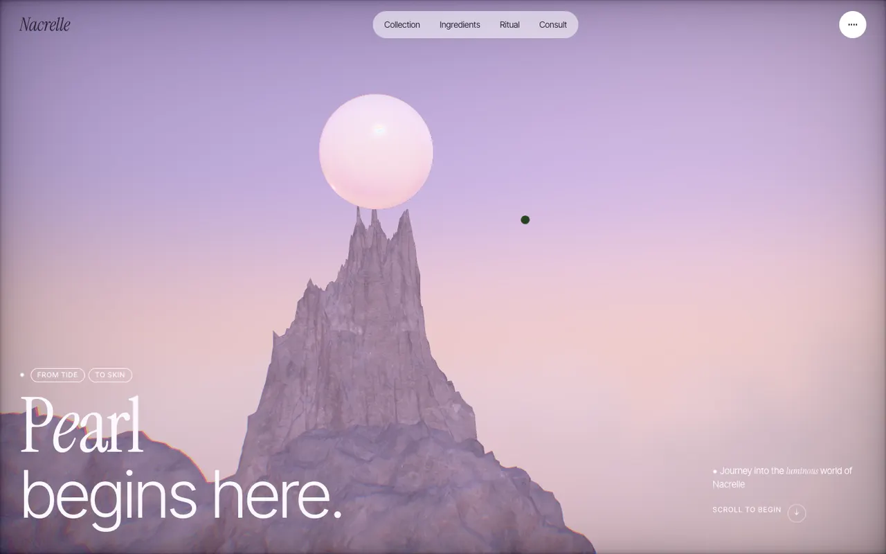
A skincare brand we invented. You fall from a summit through cloud to products floating on a still sea, and each product opens where you touch it. An example of a 3D product website.
AFTERLUX
Concept brand · Festival
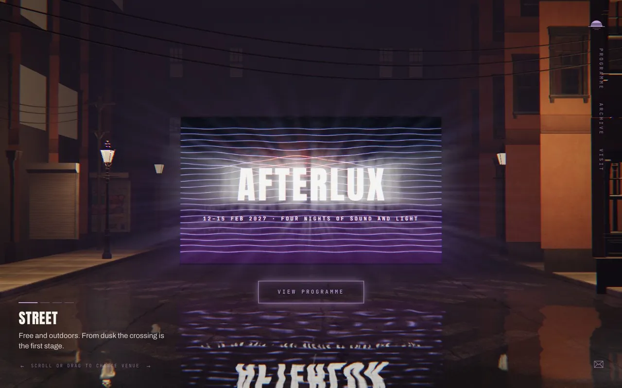
A festival site built as four rooms at four hours of the night, with one wall of light carried through all of them.
Sites that use one idea from 3D
RCRS / EXEGI
Sample build · Industrial
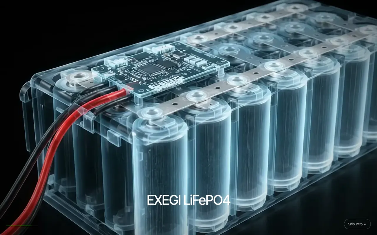
A battery maker. The opening is a short film you control by scrolling, from an x-ray of the cells to the finished pack.
Saajan Architects
Sample build · Architecture
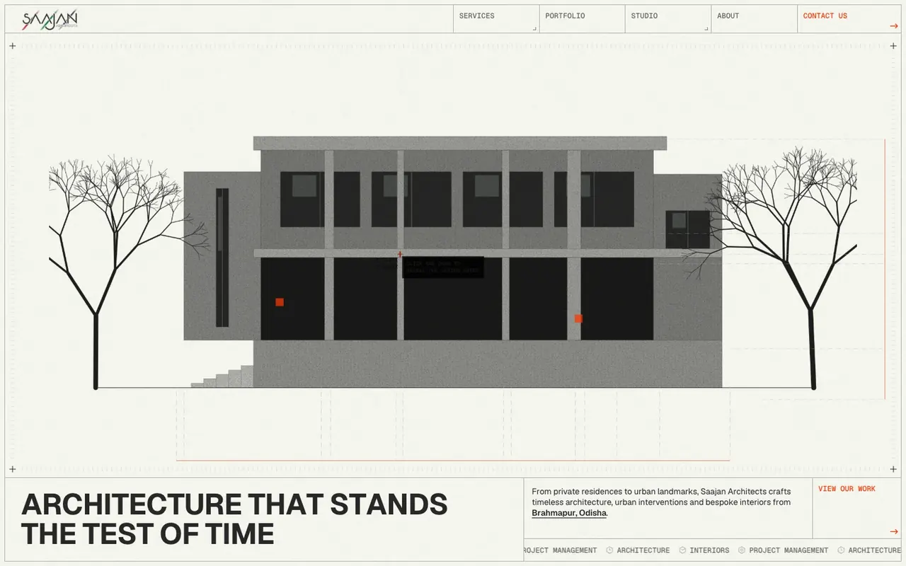
An architecture practice. Every building is drawn in code and sketches itself in as you scroll.
The Parsley Kitchen
Sample build · Restaurant
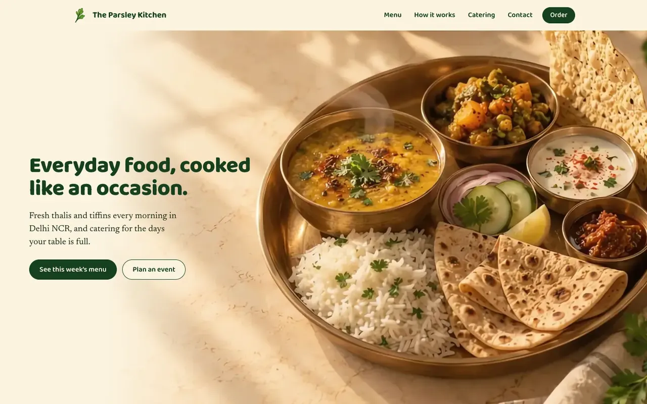
A home kitchen. The site opens on a film of the thali coming together, then goes straight to this week's menu and ordering.
Crev Studio
Sample build · Creative studio
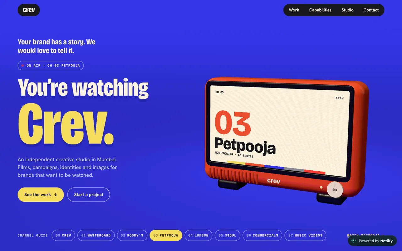
A film studio whose site behaves like a TV channel. You tune in and flick through the work.
Aumilk
Prototype · E-commerce
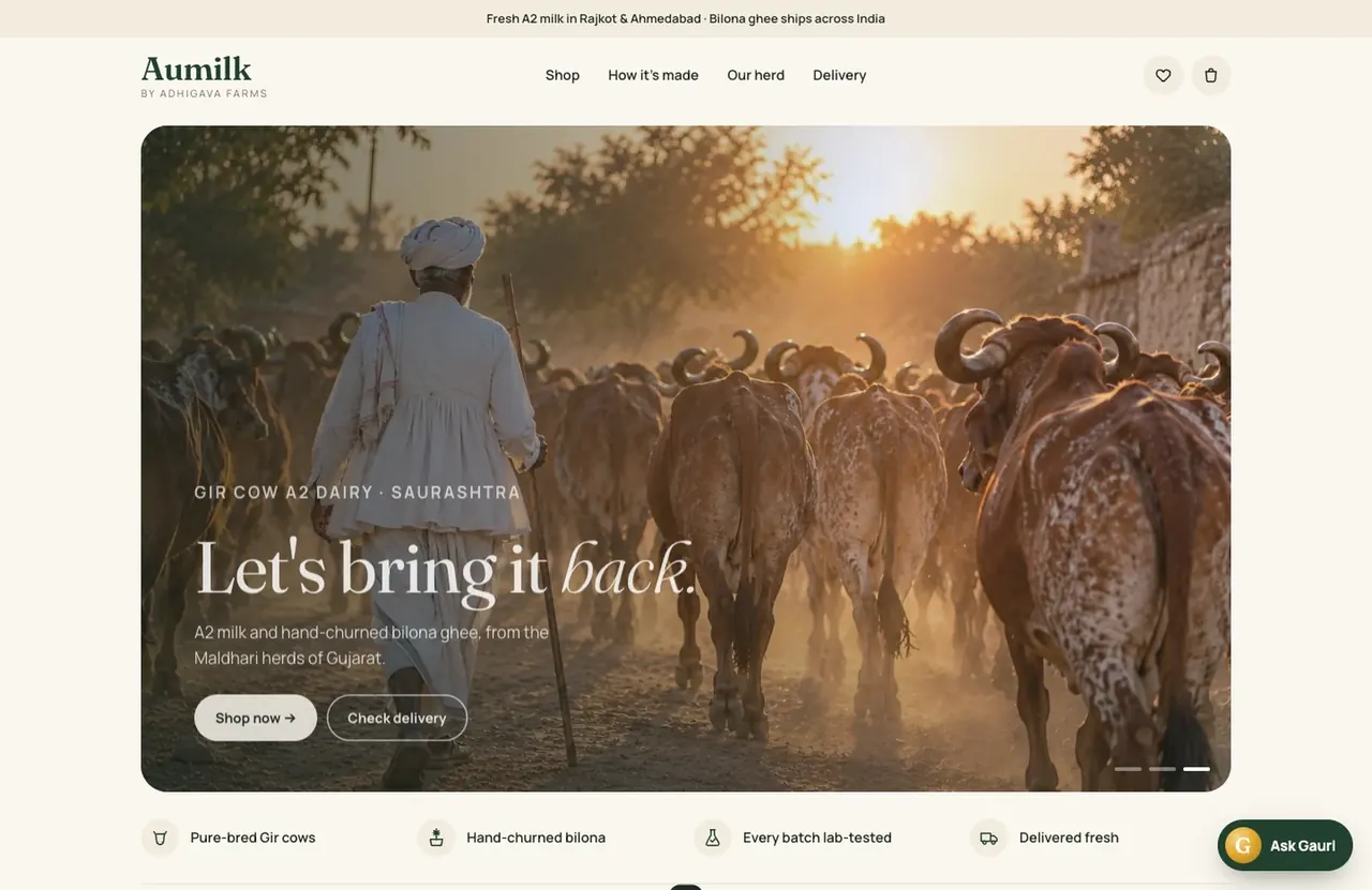
A dairy. No 3D at all: products first, and an order button that opens WhatsApp. It is here as a reminder that the right site is sometimes the plain one.
The ten at a glance
| Site | For | The idea | 3D |
|---|---|---|---|
| After Curfew | A game | A castle by wand light | Full |
| The Glass Voyage | Luxury | One case, six landscapes | Full |
| Jaywalking | Streetwear | A room for every T-shirt | Full |
| Nacrelle | Skincare | From a summit to the sea | Full |
| AFTERLUX | A festival | Four rooms, four hours | Full |
| RCRS / EXEGI | Batteries | A film you scroll | Part |
| Saajan Architects | Architecture | Buildings drawn in code | Part |
| The Parsley Kitchen | A home kitchen | The thali, then the menu | Part |
| Crev Studio | A film studio | A TV channel | Part |
| Aumilk | A dairy | Products first | None |
How to judge a 3D website
When you look at examples, ours or anyone else's, these five checks tell you most of what you need.
- Open it on your phone. Not the video of it, the site itself. If it stutters or asks you to turn the phone sideways, it was built for a laptop.
- Count the seconds to the first screen. More than five and most visitors have gone.
- Find the thing you would come for. A price, a menu, a contact form. If it takes more than two taps, the experience is in the way.
- Ask what the idea is. A good one can be said in a sentence: one case in six landscapes, a room for every T-shirt. If you cannot say it, the site is decoration.
- Search for the brand afterwards. If nothing readable comes up, there are no plain pages behind the scenes.
Which kind suits which business
A product you have to see. Jewellery, bottles, bags, furniture, anything with material and shape. Let people turn it and open it, as in The Glass Voyage and Nacrelle.
A launch or a drop. Give it a place to happen, as in Jaywalking, and keep the shop one tap away.
An event or a venue. Build the rooms, so people know what it will feel like to be there, as in AFTERLUX.
A service business. Usually one idea from 3D is enough: a film you scroll, drawings that sketch themselves. RCRS and Saajan work this way.
A business people order from every week. Keep it plain and fast. Aumilk and The Parsley Kitchen put the product and the order button first, and that is the right call.
What the good ones have in common
- One clear idea, held from the first screen to the last.
- The thing you came for, whether a product, a booking or a contact form, is never more than a tap away.
- They stay smooth on a phone.
- There is a plain, readable page behind every scene.
If you are wondering whether your brand suits one, start with what an immersive website is, or tell us what you are building.